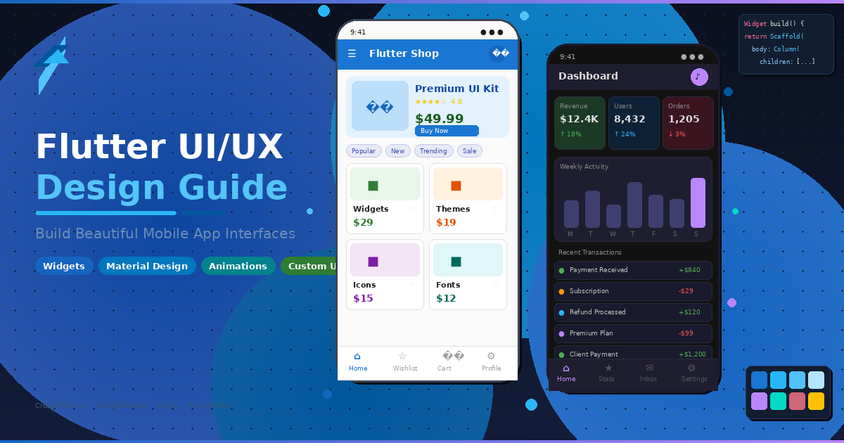
In a mobile-first world where users form opinions about an app within the first 50 milliseconds, Flutter UI design has emerged as a game-changer for developers and businesses alike. Google’s open-source UI toolkit now powers over 1 million apps on the Play Store alone, and its adoption continues to surge across startups and enterprises globally. Getting Flutter UI design right is no longer optional—it’s the difference between an app users love and one they uninstall.
But here’s the challenge: having access to a powerful framework doesn’t automatically translate into a well-designed app. Many Flutter developers struggle with creating interfaces that are both visually stunning and functionally intuitive. Poor Flutter UX design leads to high uninstall rates, negative reviews, and lost revenue.
This comprehensive guide walks you through everything you need to know about Flutter app design—from understanding the widget system and Material Design principles to building custom UI components, implementing responsive layouts, and optimizing performance. Whether you’re a startup founder planning your MVP or a seasoned developer refining your Flutter UI design craft, you’ll walk away with actionable strategies to create world-class interfaces.
Why Flutter Excels at UI Design
Flutter isn’t just another cross-platform framework—it’s fundamentally rethought how mobile UI rendering works. Unlike React Native or Xamarin, which rely on platform-native components, Flutter draws every pixel on screen using its own Skia rendering engine. This gives developers unparalleled control over every visual element, making Flutter UI design uniquely powerful among modern toolkits.
According to the Stack Overflow Developer Survey (https://survey.stackoverflow.co/), Flutter ranks as one of the most loved cross-platform frameworks, with adoption growing steadily year-over-year. Here’s why Flutter’s approach to Flutter UI design stands apart:
- Everything is a widget: From buttons to padding to entire screens, Flutter’s compositional model makes UI construction intuitive and highly customizable.
- Hot reload: See design changes in real-time without losing application state, dramatically speeding up the iteration process.
- Pixel-perfect consistency: Your Flutter app design looks identical on iOS, Android, web, and desktop—no platform-specific quirks.
- Rich animation library: Built-in support for implicit and explicit animations helps you create smooth, engaging user experiences.
- Growing ecosystem: Over 40,000 packages on pub.dev (https://pub.dev/) extend Flutter’s capabilities for virtually any design need.
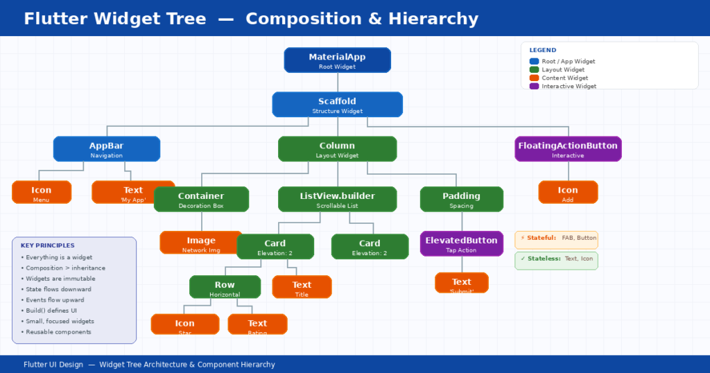
Understanding the Flutter Widget System
At the heart of every Flutter application lies the widget tree. Understanding how Flutter widgets work is essential for anyone serious about Flutter UI design. In Flutter, widgets are immutable descriptions of part of a user interface. They’re lightweight, composable, and form a tree-like hierarchy that defines your entire app’s visual structure.
Stateless vs. Stateful Widgets
Stateless widgets are immutable—once built, they don’t change. They’re perfect for static UI elements like labels, icons, or decorative components. Think of a company logo or a static text heading in your Flutter UI design.
Stateful widgets, on the other hand, maintain mutable state that can change over time. Use these for interactive components like forms, toggles, animated elements, or anything that responds to user input. Choosing the right widget type is fundamental to an effective design approach.
Widget Tree and Composition
Flutter encourages composition over inheritance. Instead of creating complex widget subclasses, you compose smaller, focused widgets together. This approach leads to cleaner, more maintainable code and makes your Flutter custom UI components reusable across projects.
A practical example: rather than building one monolithic “ProductCard” widget, compose it from a Container, Column, Image, Text, and Button—each handling its specific responsibility. This compositional approach is a hallmark of professional Flutter development.
Material Design vs. Cupertino: Choosing the Right Flutter UI Design Approach
Flutter ships with two complete design systems out of the box: Flutter material design (Google’s design language) and Cupertino (Apple’s iOS design language). Choosing the right system—or blending them—significantly impacts your Flutter UX design and overall user satisfaction.
| Feature | Material Design | Cupertino (iOS) |
| Design Philosophy | Bold, colorful, motion-rich | Clean, minimalist, subtle |
| Navigation | Bottom nav bar, drawer, tabs | Tab bar (bottom), segmented controls |
| Buttons | ElevatedButton, FilledButton, FAB | CupertinoButton, action sheets |
| Dialogs | AlertDialog with actions | CupertinoAlertDialog |
| Scrolling | Overscroll glow effect | Bounce-back scroll physics |
| Typography | Roboto font family | SF Pro font family |
| Best For | Android-first, brand-heavy apps | iOS-first, native-feel apps |
Pro tip: Many successful Flutter apps use a hybrid approach to Flutter UI design—applying Material Design as the base while swapping in Cupertino widgets for platform-specific elements using Platform.isIOS checks. The official Material Design guidelines (https://m3.material.io/) provide comprehensive direction on implementing this effectively.
Essential Flutter UI Widgets Every Developer Needs
Flutter’s widget catalog is vast, but certain Flutter widgets form the backbone of nearly every app. Mastering these essential widgets will accelerate your Flutter UI design output and development speed.
Layout Widgets
- Container: The workhorse of Flutter layout—combines decoration, padding, margin, and sizing in one widget.
- Row and Column: Arrange children horizontally or vertically with flexible alignment options.
- Stack: Layer widgets on top of each other for overlapping designs like badges or profile avatars.
- ListView and GridView: Efficiently display scrollable lists and grids of content, essential for data-heavy Flutter app design.
- Expanded and Flexible: Control how child widgets share available space within Row or Column layouts.
Input and Interaction Widgets
- TextField: Fully customizable text input with validation, decoration, and formatting support.
- Buttons (ElevatedButton, TextButton, IconButton): Each serves a distinct purpose in your visual hierarchy.
- GestureDetector and InkWell: Add tap, swipe, long-press, and other gestures to any widget.
Navigation Widgets
- AppBar and SliverAppBar: Create fixed or collapsing top navigation bars with search and action icons.
- BottomNavigationBar: Standard bottom tab navigation following Material guidelines.
- Drawer: Side navigation panel for apps with multiple top-level destinations.
Building Custom Widgets for Unique Flutter UI Design
While Flutter’s built-in widgets cover most use cases, building Flutter custom UI widgets is what separates average apps from extraordinary ones. Custom widgets let you encapsulate unique brand elements and create reusable components that maintain Flutter UI design consistency across your application.
Flutter Design Best Practices for Custom Widget Creation
- Single responsibility: Each custom widget should do one thing well. A CardWidget handles cards; it shouldn’t also manage network requests.
- Parameterize everything: Accept colors, sizes, callbacks, and content as parameters for maximum reusability across your design system.
- Favor composition: Build complex widgets by combining simpler ones rather than creating deeply nested single widgets.
- Document your widgets: Add clear documentation for props and usage examples—your future self will thank you.
For example, a custom branded button widget might accept parameters for label text, icon, gradient colors, loading state, and an onPressed callback. This single component then ensures visual consistency every time a button appears throughout the app.
The Flutter team’s official cookbook (https://docs.flutter.dev/cookbook) provides excellent examples of custom widget patterns that follow Flutter design best practices.
[Internal Link: /blog/flutter-mobile-app-development-guide]
Responsive Design in Flutter
With Flutter now targeting mobile, tablet, web, and desktop, responsive Flutter UI design is no longer optional—it’s essential. A Flutter app that looks perfect on a Pixel phone but breaks on an iPad will frustrate users and hurt your brand.
Key Tools for Responsive Flutter UI Design Layouts
MediaQuery gives you access to the device’s screen dimensions, orientation, text scaling, and platform brightness. Use it to make dynamic sizing decisions.
LayoutBuilder provides the parent widget’s constraints, letting you build different layouts based on available space rather than absolute screen size.
Flexible and Expanded widgets work within Row and Column to proportionally distribute space, creating fluid layouts that adapt naturally.
Responsive Breakpoints Reference
| Device Type | Width Range | Layout Strategy | Column Count |
| Small Phone | < 360px | Single column, compact | 1 |
| Phone | 360–600px | Single column, standard | 1–2 |
| Tablet (Portrait) | 600–900px | Two-column or master-detail | 2–3 |
| Tablet (Landscape) | 900–1200px | Multi-column, expanded | 3–4 |
| Desktop / Web | > 1200px | Full multi-pane layout | 4+ |
Flutter Animations: Bringing Your Flutter UI Design to Life
Animation is where Flutter UI design truly shines. The framework provides a comprehensive animation system that ranges from simple implicit animations to complex, choreographed motion sequences. Well-designed animations improve perceived performance, guide user attention, and make your Flutter app design feel polished and professional.
Implicit Animations
Implicit animations are the easiest way to add motion to your Flutter UI design. Widgets like AnimatedContainer, AnimatedOpacity, AnimatedPadding, and AnimatedAlign automatically animate between old and new values when their properties change. Simply change a property value, and Flutter handles the transition seamlessly.
Explicit Animations
For more control over your Flutter UI design animations, explicit animations use AnimationController and Tween objects. These let you define precise timing curves, chain multiple animations, and create complex motion sequences. Hero animations, for example, create stunning shared-element transitions between screens.
Custom Animation Controllers
Advanced Flutter app design often requires custom animation controllers for staggered animations, particle effects, or physics-based motion. The AnimationController class provides fine-grained control over duration, repeat behavior, and status listeners. Combine it with CurvedAnimation for natural-feeling easing curves that elevate your Flutter UI design.
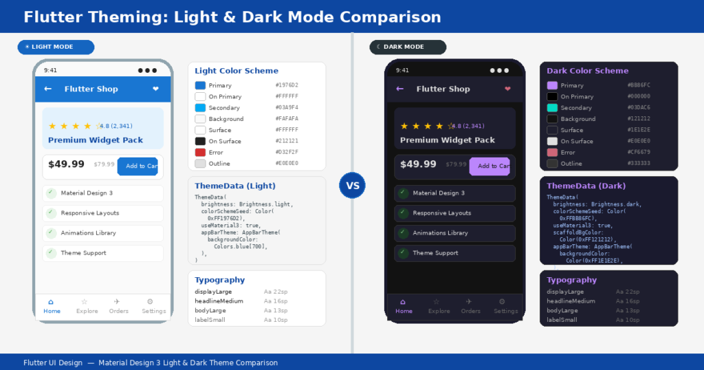
Theming and Styling Your Flutter App
A consistent visual theme is the hallmark of professional Flutter material design. Flutter’s ThemeData class lets you define colors, typography, shape, and component styles in one centralized location—ensuring your entire Flutter UI design maintains visual coherence.
- Light and dark themes: Define both and let users switch between them, or automatically match the system preference using ThemeMode.system.
- Custom color schemes: Use ColorScheme.fromSeed() in Material 3 to generate a complete, harmonious color palette from a single seed color.
- Text themes: Define a TextTheme with styles for headlines, body text, labels, and captions to maintain typographic consistency.
- Component themes: Override default styles for specific widgets (ButtonThemeData, CardTheme, InputDecorationTheme) to match your brand.
Design Patterns for Scalable Flutter Apps
As your Flutter app grows, architecture becomes critical for maintaining a clean, testable UI layer. The right design pattern separates business logic from presentation, making your codebase easier to maintain and scale.
BLoC (Business Logic Component) is the most widely adopted pattern in the Flutter community. It uses streams and sinks to separate UI from business logic, making your widgets purely presentational. The flutter_bloc package simplifies implementation with BlocBuilder and BlocProvider.
Provider is Flutter’s recommended state management solution for simpler applications. It’s lightweight, uses InheritedWidget under the hood, and integrates seamlessly with Flutter’s widget lifecycle for efficient UI updates.
MVVM (Model-View-ViewModel) offers a familiar pattern for developers coming from native Android or iOS backgrounds. It cleanly separates data, logic, and presentation layers.
Accessibility in Flutter UI Design
Building accessible apps isn’t just good ethics—it’s good business. Over 1.3 billion people globally live with some form of disability, and accessible Flutter UI design reaches a wider audience while often ranking better in app store search results.
Flutter provides robust accessibility support through its Semantics widget, which communicates UI structure and behavior to screen readers like TalkBack (Android) and VoiceOver (iOS). Key accessibility practices include:
- Add semantic labels to all interactive elements and images using the Semantics widget or the semanticLabel property.
- Ensure minimum touch targets of 48×48 logical pixels for all tappable elements.
- Maintain WCAG-compliant contrast ratios—at least 4.5:1 for normal text, 3:1 for large text. Use the WebAIM Contrast Checker to verify.
- Support dynamic text scaling so users with vision impairments can increase text size.
- Test with screen readers on both platforms during development, not just before release.
Performance Optimization for Flutter UI
A beautifully designed UI that lags or drops frames will frustrate users regardless of its visual appeal. Flutter targets 60fps (or 120fps on supported devices), and maintaining that standard requires careful attention to rendering performance.
Use const constructors wherever possible. When a widget is declared as const, Flutter knows it won’t change and can skip rebuilding it entirely during the render cycle—a simple but impactful optimization.
Minimize repaint boundaries by using RepaintBoundary to isolate frequently updating widgets. This prevents expensive repaints from cascading through the widget tree.
Avoid unnecessary rebuilds by keeping your build methods lean. Move expensive computations outside the build method and cache results where appropriate.
Profile with DevTools: Flutter DevTools (https://docs.flutter.dev/tools/devtools/overview) provides Timeline, Memory, and Widget Inspector views to identify performance bottlenecks. Run your app in profile mode for accurate measurements.
Design Tools That Enhance Flutter UI Design Workflows
Modern Flutter UI design benefits from a rich ecosystem of design tools that bridge the gap between designers and developers. Using the right tools streamlines handoff, reduces miscommunication, and accelerates the design-to-code pipeline.
- Figma (https://www.figma.com/): The industry-standard collaborative design tool. Plugins like Figma to Flutter export design tokens and generate boilerplate widget code.
- Adobe XD: Offers Flutter-specific export plugins and integration with Adobe’s broader creative suite.
- Zeplin: Generates style guides and specs from design files, making it easy for developers to extract exact colors, spacing, and typography values.
- FlutterFlow: A low-code visual builder that generates clean Flutter code, useful for rapid prototyping.
- Widgetbook: An open-source tool for cataloging and testing widgets in isolation—similar to Storybook for web development.
Explore the official Flutter widget catalog at https://docs.flutter.dev/ui/widgets for a complete reference of available Flutter widgets and their usage patterns.
Common Flutter UI Design Mistakes and How to Avoid Them
Even experienced developers fall into common traps that undermine their Flutter design best practices. Here are the most frequent Flutter UI design mistakes and how to sidestep them:
Deeply nested widget trees: When your build method looks like a sideways pyramid, it’s time to refactor. Extract reusable components into separate widget classes to improve readability and performance.
Ignoring platform conventions: iOS users expect back-swipe navigation and bottom tab bars. Android users expect material-style navigation drawers. Respect these conventions or risk confusing users.
Hardcoding dimensions: Using fixed pixel values makes your Flutter app design brittle on different screen sizes. Use relative sizing with MediaQuery, FractionallySizedBox, or LayoutBuilder instead.
Skipping error states: Always design for loading, empty, error, and success states. A screen that shows nothing while data loads leaves users wondering if the app crashed.
Overusing setState: Calling setState at the top of your widget tree triggers unnecessary rebuilds. Use targeted state management solutions like BLoC or Provider for more efficient UI updates.
Frequently Asked Questions (FAQ)
Below are answers to the most commonly asked questions about Flutter UI design, formatted for FAQ schema compatibility.
Q: What makes Flutter UI design different from other frameworks?
Flutter UI design stands apart because Flutter renders every pixel using its own Skia rendering engine rather than relying on platform-native components. This means your app looks and behaves identically across iOS, Android, web, and desktop. The widget-based compositional approach also makes building complex, custom interfaces significantly faster compared to frameworks like React Native or Xamarin.
Q: Can I use Flutter for both Material Design and iOS-style interfaces?
Yes. Flutter includes both Material (Google) and Cupertino (Apple) widget libraries. You can use platform detection to serve the appropriate design system to each user, or create a custom hybrid approach that blends elements from both. Many production apps use Material as a base and add Cupertino-specific components for iOS users.
Q: How do I make my Flutter UI design responsive across different screen sizes?
Use a combination of MediaQuery for device dimensions, LayoutBuilder for parent constraints, and flexible layout widgets like Expanded and Flexible. Define breakpoints for phone, tablet, and desktop layouts and use conditional rendering to adapt your UI. Flutter’s built-in tools handle most responsive scenarios without third-party packages.
Q: What is the best state management approach for Flutter UI design?
It depends on app complexity. For simple apps, Provider or Riverpod is lightweight and effective. For medium-to-large apps with complex state flows, BLoC provides excellent separation of concerns. GetX offers a simpler API for rapid development. The key is choosing one pattern and applying it consistently throughout your project.
Q: How do I optimize Flutter app performance for smooth animations?
Use const constructors to prevent unnecessary rebuilds, isolate animated widgets with RepaintBoundary, keep build methods lean, and profile your app using Flutter DevTools in profile mode. Avoid heavy computations in the build method, use ListView.builder for long lists, and cache images with CachedNetworkImage to reduce memory usage.
Q: Is Flutter suitable for enterprise-level applications?
Absolutely. Companies like Google, BMW, Alibaba, eBay, and Nubank use Flutter for production apps serving millions of users. Flutter’s strong typing with Dart, comprehensive testing framework, and growing ecosystem of enterprise-grade packages make it well-suited for large-scale applications that require maintainability and high-quality UI design.
Key Takeaways
- Flutter UI design gives you complete control over every pixel, enabling pixel-perfect cross-platform interfaces through its widget-based architecture.
- Choose between Material Design and Cupertino based on your target audience, or use a hybrid approach for the best of both worlds.
- Composition over inheritance: Build complex UIs by combining small, focused, reusable Flutter widgets.
- Responsive design is essential—use MediaQuery, LayoutBuilder, and flexible widgets to support every screen size.
- Invest in theming early. A well-configured ThemeData ensures visual consistency and makes future changes painless.
- Performance matters as much as aesthetics—use const constructors, minimize rebuilds, and profile regularly with DevTools.
- Accessibility isn’t optional. Semantic labels, touch targets, and contrast ratios make your app usable by everyone.
- Choose a scalable state management pattern (BLoC, Provider, or MVVM) and apply it consistently from day one.
Ready to Build a Stunning Flutter App?
Great Flutter UI design doesn’t happen by accident—it’s the result of thoughtful architecture, proven design patterns, and relentless attention to detail. Whether you’re launching a new mobile app, redesigning an existing product, or building your company’s next MVP, the principles in this guide will help you create interfaces your users will love.
Need expert help bringing your Flutter UI design vision to life? Our team specializes in delivering production-grade Flutter apps for startups and enterprises worldwide—from MVPs that secured funding to full-scale platforms serving thousands of daily users.
➡ Get a Free UI/UX Consultation – Let’s discuss your project and explore how Flutter can bring your vision to life.
![Laravel + React: The Complete Guide for Business Owners and Beginners [2026]](https://blog.binary-fusion.com/wp-content/uploads/2026/02/Gemini_Generated_Image_665qn8665qn8665q.png)

Leave a Reply